
Key Takeaways
- Earthy and natural tones are gaining popularity for their calming effects.
- Bold accent walls and color blocking add dynamic energy to spaces.
- Sustainable and eco-friendly paints are becoming a standard choice.
- Innovative techniques, such as color drenching and color capping, are on the rise.
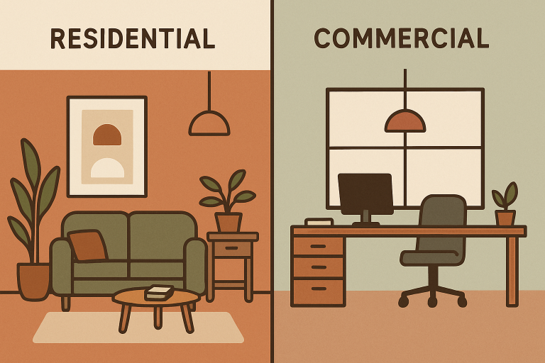
Staying current with interior color trends can dramatically influence the mood, style, and value of any space—whether residential or commercial. By choosing fresh palettes and contemporary painting techniques, homeowners and business leaders create environments that are not only visually stunning but also welcoming and reflective of today’s design sensibilities. Anyone interested in interior painting Louisville should consider these emerging trends for their next project, transforming both homes and commercial offices with creativity and purpose.
Today’s most impactful paint trends emphasize atmosphere and well-being. Designers are shifting away from sterile minimalism to incorporate richer tones, innovative applications, and a greater emphasis on environmental responsibility. Smart color choices foster positive feelings, reinforce branding in commercial settings, and express individual personality at home.
Choosing the right colors not only enhances aesthetics but can also drive productivity, comfort, and brand loyalty. With demand rising for customization and healthier interiors, experts recommend strategies that blend trendsetting design with functionality and wellness.
Leading décor sources such as Architectural Digest detail how color can define zones in open offices or accentuate architectural details at home, setting a new standard for versatile, on-trend spaces.
Embracing Earthy and Natural Tones
Earth-inspired colors are dominating residential and commercial palettes. Shades such as terracotta, sage green, muted browns, and warm clay are favored for their ability to nurture a sense of calm. These natural tones are particularly desirable for spaces dedicated to wellness, such as yoga studios, spas, or relaxation areas in homes, making rooms feel tranquil and grounded.
Interior designers recommend layering these cozy colors across walls, textiles, and even ceilings for an immersive retreat-like effect. Such hues support the ongoing movement toward biophilic design, which seeks to connect occupants with nature.
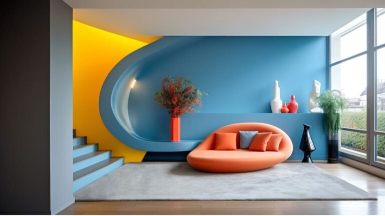
Bold Accent Walls and Color Blocking
Adding personality through bold accent walls or experimenting with color blocking is a striking trend for both residential and commercial interiors. Color blocking involves using contrasting colors—often in geometric patterns or unique placements—on different surfaces, creating energy, depth, and visual interest.
In open-plan offices, commercial showrooms, and modern homes, color blocking can distinguish functional zones or add dramatic flair to feature walls. Deep blues, emerald greens, and vibrant yellows are among the top choices to draw attention and inspire creativity. Accent walls enable property owners to experiment with daring hues without overwhelming a space.
Sustainable and Eco-Friendly Paints
Growing environmental consciousness has increased the demand for paints that are more gentle on both the planet and personal health. Low-VOC and zero-VOC paints, made from biodegradable ingredients and often packaged in recycled materials, are now mainstream.
These products ensure superior indoor air quality, especially important in schools, childcare facilities, and offices where air circulation can be limited. Selecting brands that support sustainability is also a statement of social responsibility for both homeowners and commercial property managers. Publications like Architectural Digest regularly review the environmental and performance standards of top paint brands, helping consumers make informed choices.
Innovative Techniques: Color Drenching and Color Capping
Inventive paint application techniques are trending, promising bolder and more cohesive interiors. Color drenching involves saturating a room—walls, ceiling, moldings, and furniture—in a single, dominant shade. This effect can create a cocoon-like feel or make a dramatic statement with rich reds or blues, exemplified in actor Johnny Galecki’s famed deep-red library.
Color capping, meanwhile, uses graduated versions of a single color, including on the ceiling, to visually expand the space and introduce subtle dimension. Both effects are especially popular in the creative industries, hospitality, and luxury residential projects that seek a curated, immersive look.
Soft Pastels for a Modern Touch
Soft pastels—such as powder blue, dusty rose, and light lavender—are now regarded as tools to promote tranquility, productivity, and a fresh energy. These hues are increasingly popular in commercial offices seeking to adopt a modern aesthetic while providing employees with a peaceful environment.
Pastels offer flexibility across various design styles, working beautifully in children’s rooms, boutique retail spaces, or meeting rooms that seek a softer edge without sacrificing visual appeal. Layered with bolder accents, pastels create a dynamic but approachable outcome.
Warm Neutrals Replacing White and Gray
Craving more warmth than clinical whites or cool grays provide, designers are turning to creamy whites, beiges, taupes, and caramel tones for interiors that feel both sophisticated and welcoming. These warm neutrals bring subtle character to residential living rooms, hotel lobbies, and healthcare waiting areas.
This approach ensures that spaces retain brightness and versatility while avoiding a sterile or institutional feel. Paired with rich woods, metallic accents, or natural fibers, warm neutrals create a timeless backdrop suitable for many décor themes.
Color Psychology in Commercial Spaces
Color isn’t just about style—it’s also about how occupants feel and behave. More commercial spaces are incorporating color psychology into their paint choices. Blues and greens enhance concentration and calm in offices; reds and oranges stimulate appetite in restaurants or boost excitement in retail settings. Understanding these principles ensures the space serves its purpose, supports users’ needs, and strengthens a brand’s identity.
Employing these strategies thoughtfully can lead to increased employee satisfaction, a better customer experience, and higher productivity.
Conclusion
Keeping up with color trends in painting is more than just style—it’s a way to enhance comfort, health, and functionality. Whether aiming for a calm retreat, a bold and creative workspace, or an environmentally responsible facility, integrating earthy tones, strong accents, sustainable materials, and cutting-edge techniques can create extraordinary spaces. By recognizing today’s leading trends, property owners and managers ensure environments that are fresh, unique, and tailored to both present need and future growth.