
Interior design trends shift fast. One year, it’s all about minimalism. The next? Maximalism floods every mood board, but there’s one design element that’s quietly stayed on top: abstract wallpaper.
It’s not loud. It’s not cliché, but it is powerful.
Interior designers, stylists, and DIYers are using it to elevate plain spaces. A single wall can go from boring to editorial with the right pattern. And the beauty of abstract wallpaper? It works everywhere. No rules. No boundaries. Just creative freedom.
Let’s break it down.
What Exactly Is Abstract Wallpaper?
It’s not florals. Not stripes. Not your grandma’s toile.
Abstract wallpaper uses shapes, colors, and forms that don’t represent anything specific. Think of modern art. Now think of that on your walls.
It can be:
- Bold color blocks
- Chaotic linework
- Soft gradients
- Surreal shapes
It creates mood, not messages. It’s designed to evoke feelings, not depict a scene.
That’s why designers love it. It lets them create a vibe without telling a story.
Why It’s Dominating High-End Design Right Now
Designers aren’t just slapping abstract patterns on walls for fun. There are reasons it’s trending.
1. It Adds Depth—Fast
Most walls are flat and forgettable. But abstract wallpaper brings instant dimension. With layered patterns or dynamic shapes, even a tiny room can feel like an art gallery.
2. It Plays Well with Light
Abstract designs reflect and absorb light differently depending on color and texture. In bright rooms, they glow. In low light, they smolder. You get drama without effort.
3. It’s Flexible
Modern, boho, retro, even coastal—abstract wallpaper fits into any style. You don’t need to match the design exactly. In fact, contrast usually looks better. A minimal room with bold abstract wallpaper? Iconic.
Where to Use It for Maximum Impact
The right placement makes or breaks this look. Abstract wallpaper shouldn’t feel random. It should feel intentional.
Here’s where it really shines:
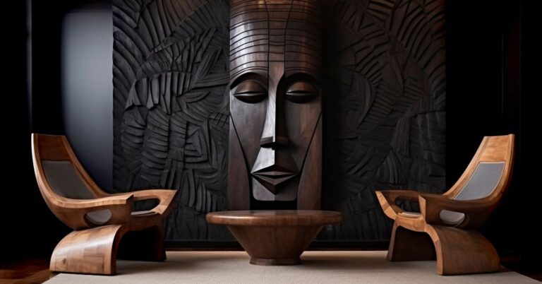
1. Accent Walls in Living Rooms
Skip the TV wall. Put the wallpaper behind a statement sofa instead. It frames the seating area and draws the eye to the center of the room.
2. Entryways
First impressions matter. A bold, abstract wall behind a simple console table? Chic. It creates a “wow” moment before guests even take off their shoes.
3. Home Offices
Working from home doesn’t mean staring at a beige wall. A moody, abstract backdrop boosts focus and creativity. Just keep the pattern subtle if you’re on Zoom often.
4. Bedrooms
Use calming tones—think soft blues, muted blush, or sand. Put it behind the headboard to create a cozy focal point.
5. Bathrooms
People forget about bathroom walls. But abstract wallpaper in a powder room? Total game changer. It feels expensive without major renovations.
Mistakes to Avoid
This look is modern, but it’s easy to mess up. Here’s how to avoid common wallpaper disasters:
✖️ Don’t Mix Too Many Patterns
If your wallpaper has wild geometry, keep the textiles solid. Your space shouldn’t look like a circus.
✖️ Don’t Use the Wrong Scale
Tiny prints in a big room? They’ll get lost. Oversized shapes in a closet? They’ll overwhelm. Match the scale to the space. Large rooms = large prints. Small spaces = tighter patterns.
✖️ Don’t Forget the Finish
Some wallpapers are matte. Others have gloss or texture. Consider lighting and room function. Glossy finishes reflect light but show flaws. Matte feels luxe but absorbs everything.
Styling Tips: What to Pair with Abstract Wallpaper
It’s not just about the wallpaper. It’s about how everything else works with it.
Try these pairings:
➕ Natural Wood
Raw oak or walnut brings warmth. It balances cold, graphic patterns and keeps the room grounded.
➕ Metal Accents
Brass, chrome, or matte black hardware all pop against abstract designs. Use them in lamps, side tables, or hardware.
➕ Neutral Furniture
Let the wall shine. Stick to beige, gray, black, or cream sofas and chairs. Then add color in small doses—pillows, art, rugs.
➕ Sculptural Decor
Think ceramic vases. Geometric shelves. Art books. Abstract wallpaper and sculptural pieces are best friends. They create flow and visual interest.
Best Colors for Each Room
Color makes or breaks abstract wallpaper. Go too loud, and you’ll regret it. Go too soft, and it’ll disappear.
Here’s a cheat sheet:
Living Room
- Terracotta
- Deep navy
- Charcoal
These add mood without killing comfort.
Bedroom
- Sage green
- Soft lavender
- Blush
Peaceful, romantic, and easy on the eyes.
Office
- Muted teal
- Burnt orange
- Dusty blue
Stimulating but not aggressive. Great for focus.
Bathroom
- Charcoal with gold
- Marble print
- Seafoam
Small space = big drama. Don’t hold back here.
Don’t Want to Commit? Try These Hacks
Wallpaper is a commitment. But there are ways to fake it.
✅ Use Peel-and-Stick
Many brands offer high-end peel-and-stick wallpaper now. Easy to apply. Easy to remove. No paste. No drama.
✅ Frame It
Buy one panel. Put it in a large frame. Hang it like art. You get the pattern without the commitment.
✅ Try Half Walls
Use wallpaper on the top half of the wall. Paint the bottom. Add chair rail trim for a clean finish. It’s bold and classic.
Final Thoughts
Abstract wallpaper isn’t just a trend. It’s a tool. One that lets you create depth, mood, and impact—without needing a full renovation.
Whether you’re a designer or just someone tired of boring walls, this is the upgrade you’ve been waiting for.
And if you’re ready to transform your space? Start with this collection.
Design bold. Live well.