
You’ve probably seen it hundreds of times on trucks, boxes, or storefronts. But did you know there’s a hidden arrow in the FedEx logo? This tiny design trick has surprised graphic design students, marketers, trivia lovers, and everyday people around the world. If you’ve missed it, you’re not alone.
Quick Answer: Where is the arrow in the FedEx logo?
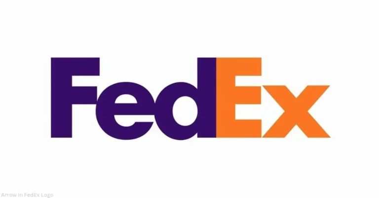
The hidden arrow in the FedEx logo is found in the white space between the letters E and x. It points to the right and stands for speed, accuracy, and forward thinking. Once you see it, you can’t unsee it.
What Makes the FedEx Logo So Special?
The FedEx logo is more than just letters. It hides a smart secret—an arrow. This arrow shows the brand’s message: fast and forward. It’s a perfect example of how design can speak without using words.
A Closer Look at the FedEx Logo Design

- The arrow is not drawn. It appears from the empty space.
- It’s placed between the “E” and the “x”.
- This trick uses negative space to create meaning.
Who Designed the FedEx Logo and Why?
The designer is Lindon Leader, a branding expert from Landor Associates.
“The arrow wasn’t a happy accident. It was a planned message about speed and direction.” — Lindon Leader, Fast Company
The leader didn’t want the arrow to be too obvious. He wanted people to find it and feel a sense of discovery.
What Does the Arrow in the FedEx Logo Represent?

The arrow is a symbol. It stands for:
- Speed
- Accuracy
- Moving forward
FedEx ships things fast. The arrow says that but silently.
How the FedEx Logo Uses Negative Space Effectively
Negative space is the empty area around and between shapes. Designers use it to make hidden shapes or meanings. In the FedEx logo, it forms the arrow.
Other Famous Logos with Hidden Meanings
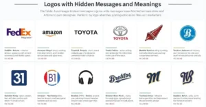
| Brand | Hidden Symbol | Meaning |
| Amazon | Arrow from A to Z | They sell everything from A to Z |
| Baskin Robbins | Number 31 in BR | 31 flavors of ice cream |
| Toblerone | Bear in the mountain | Swiss heritage, from Bern |
Why the FedEx Logo Became a Design Icon
- Voted one of the top logos of all time by creative experts
- Used in branding courses to teach logo psychology
- A case study in minimal design with maximum impact
“A logo should tell a story. The FedEx logo does it without saying a word.” — Paul Rand, design legend (AIGA Interview)
Secret in the FedEx Logo: How People React
Many people don’t notice the arrow at first. Once they do, they’re amazed.
“I never saw it until someone pointed it out. Now I see it every time!” — Marketing student, UCLA
It becomes a puzzle solved. And people love that.
Final Thoughts
The FedEx logo shows how simple design can do big things. One small arrow shares the whole story of a brand. Whether you’re a designer, teacher, or just curious, this is one logo worth a second look.
FAQ’s
Where is the arrow hidden in the FedEx logo?
It’s between the E and x. It’s made from white space.
What does the arrow in the FedEx logo represent?
It stands for speed, direction, and trust.
Who designed the FedEx logo and why is there an arrow?
Lindon Leader made it in 1994 to show the company’s fast service.
Is there really an arrow in the FedEx logo?
Yes. It’s subtle, but very real.
How the FedEx logo uses negative space effectively?
It hides a message in the space between letters. It’s smart design.
Which logos have hidden arrows like FedEx?
Amazon, Toblerone, and Baskin Robbins all use this trick.
Expert References:
- Lindon Leader, Interview with Fast Company — Link
- AIGA (American Institute of Graphic Arts) Logo Studies
- Creative Bloq, “Best Logos of All Time” List